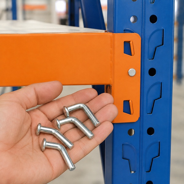
Step into any well-organized warehouse, and you're likely to spot a familiar color pairing: vibrant orange beams and stable blue uprights. This isn’t a coincidence—it’s a strategic combination designed to enhance efficiency, safety, and visual clarity.
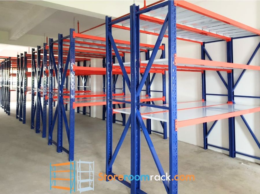
🔶 Orange Beams: Attention Where It Matters
The horizontal beams of a warehouse rack bear the load and are where most interactions occur. Orange is a high-visibility color that naturally draws the eye.
- Safety First: Orange is widely recognized as a cautionary color, helping prevent collisions and mishandling.
- Operational Clarity: Workers quickly spot load levels and identify shelving zones, reducing search and handling time.
🔷 Blue Uprights: Stability Meets Calm
The vertical columns—known as uprights—carry the structural weight of the entire rack. Blue is more than just visually appealing—it conveys dependability.
- Psychological Comfort: Blue evokes calm and focus, ideal for high-paced environments.
- Visual Contrast: When paired with orange, it provides a clean, organized look that improves navigation and workflow
Color isn’t just about style—it improves productivity.
- Quick Identification: Helps employees visually map the warehouse layout.
- Enhanced Safety: Minimizes risk in high-traffic zones, especially where forklifts and human movement intersect.
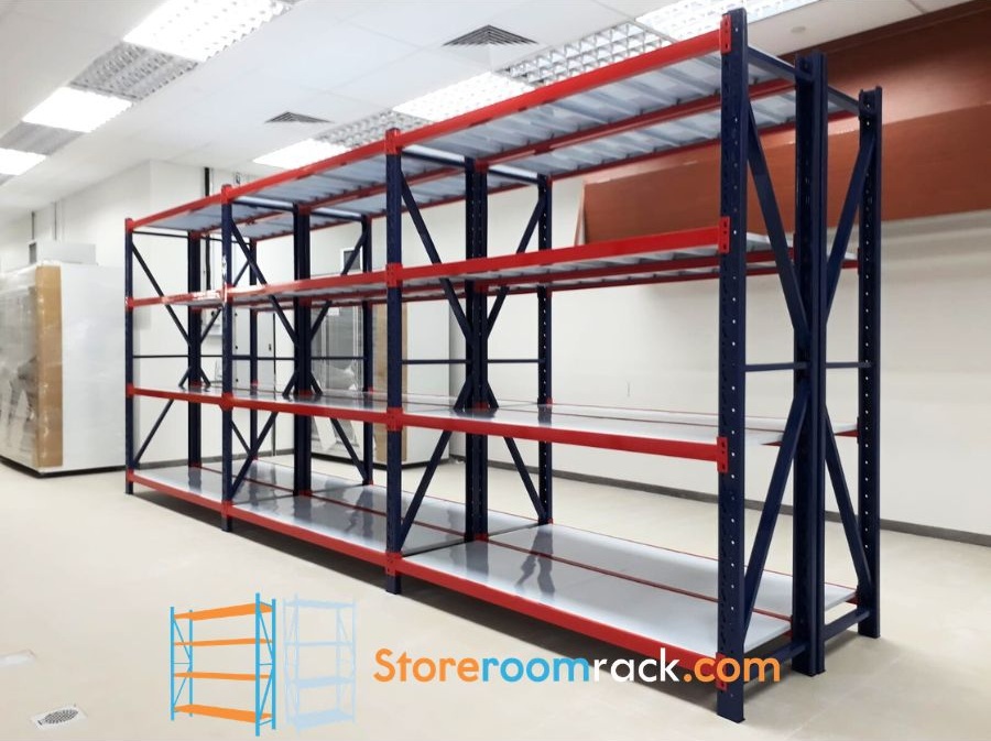
🇸🇬 Local Best Practices
In Singapore, the blue-and-orange scheme is often used in compliance with safety standards and ergonomic warehouse design principles. It supports an efficient work environment while aligning with industrial visual coding norms.